Omnify
Building the Omnify
Design System from Scratch
Role
Lead Product Designer
Team
1 Product Designer
1 Webflow Developer
Dev Team
COMPANY CONTEXT
Omnify is an integrated platform that helps businesses sell and schedule services, engage with customers, and automate daily operations.
Overview
This case study outlines the development of a unified design system for the Omnify Dashboard to resolve visual inconsistencies and improve design workflows. As Product Design Lead, I led a small team to create a cohesive visual language and reusable components, enhancing design efficiency and consistency.

Problem
Statements
Inconsistent design elements across layout, typography,
color, and iconography.
Duplicated components with varying styles.
Lack of responsive design, complicating user navigation
and usability.
IMPACT
These inconsistencies led to a fragmented user experience, making it difficult for users to understand how different parts of the application were related. For the design team, the absence of a standardized system resulted in increased development time, confusion, and a higher likelihood of design errors.
Challenges
& constraints
Limited timeline of 1 month to handoff the
design system to devs
Absence of documentation and design components provided no reference points for redesigns.
The dashboard’s complex backend structure made even minor changes challenging, requiring careful adjustments to avoid disruptions.
Step 1 : The Design Audit
INSIGHTS FROM OUR AUDIT
Magnitude of the issue
38 Individual components used across the dashboard - each carrying their inconsistent patterns and appearing in variations across different pages in the dashboard.
Lack of standardization in typography, color, iconography, and visual assets resulted in a very random design language
Step 2 : Setting up the foundations
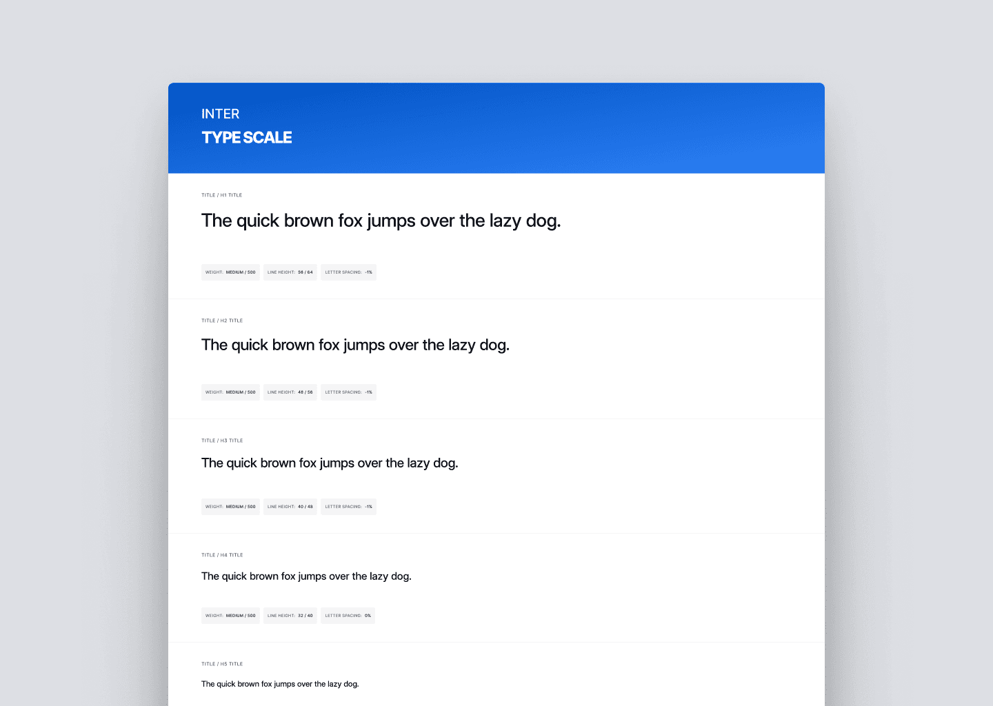
Typography
We selected ‘Inter’ for its versatility, readability, and extensive features, providing a consistent and clear typographic foundation for the Omnify Dashboard.
Colors
The core consideration while setting up the color palette was scalability of the palette & accessibility.

Grids & Spacing
We implemented a 12-column grid with a 260px offset for consistent layout across the dashboard.
The 4px spacing system was chosen for its versatility across screens.

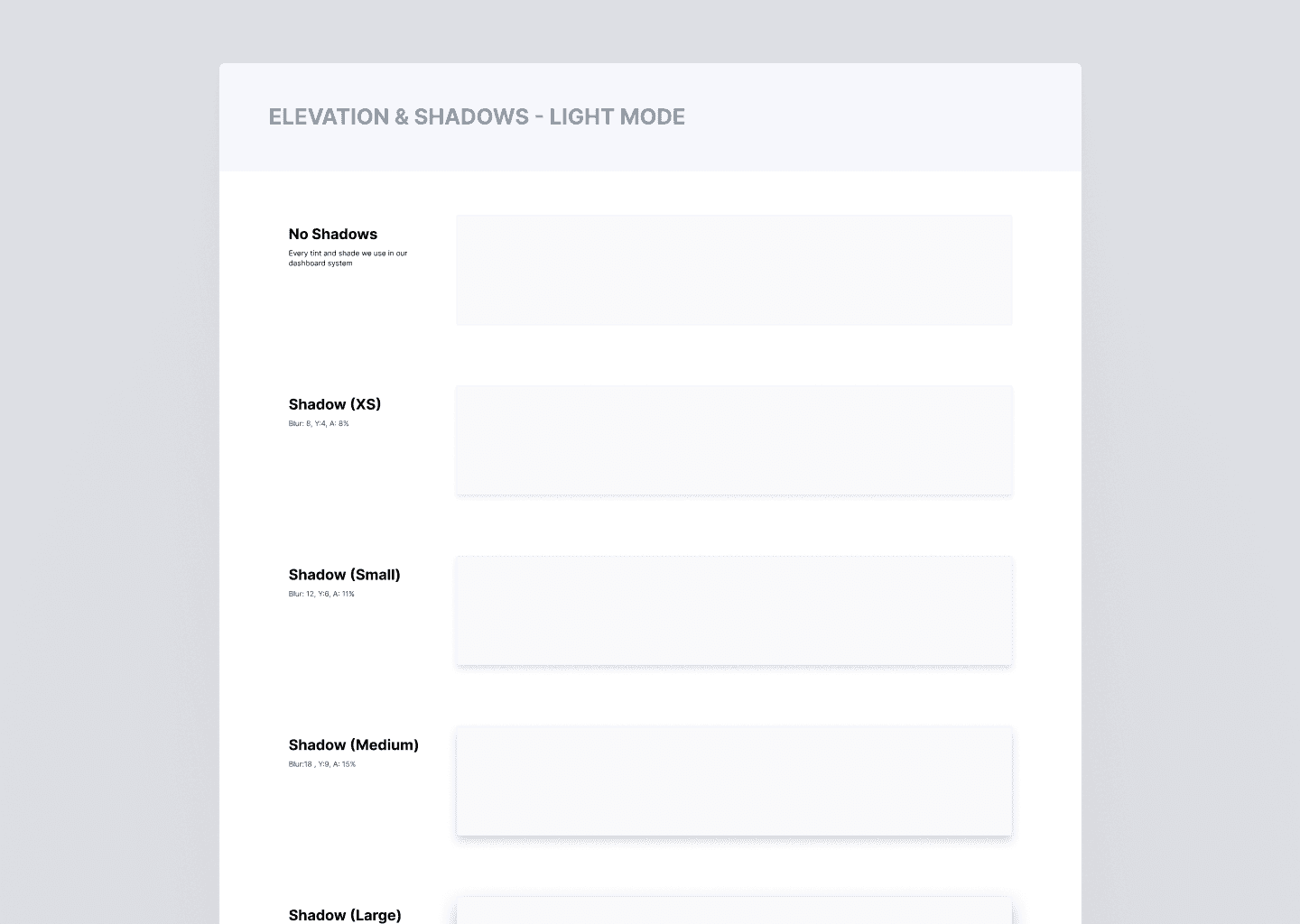
Shadows & Elevation
Iconography
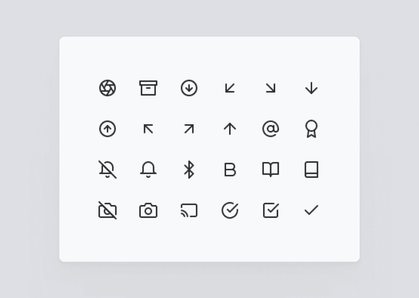
We have implemented the Feather Icons icon set in this version of our design system.
Step 3 : Designing the Components
A total of 16 component sets were designed for different elements of the design system, here are a few of them:
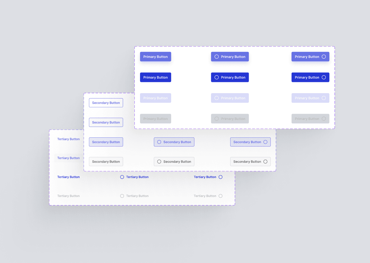
Buttons
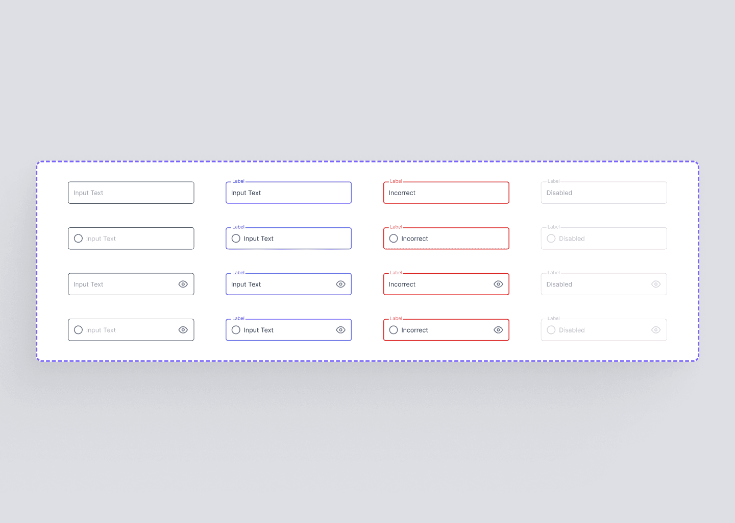
Input Fields

Banners & Alerts
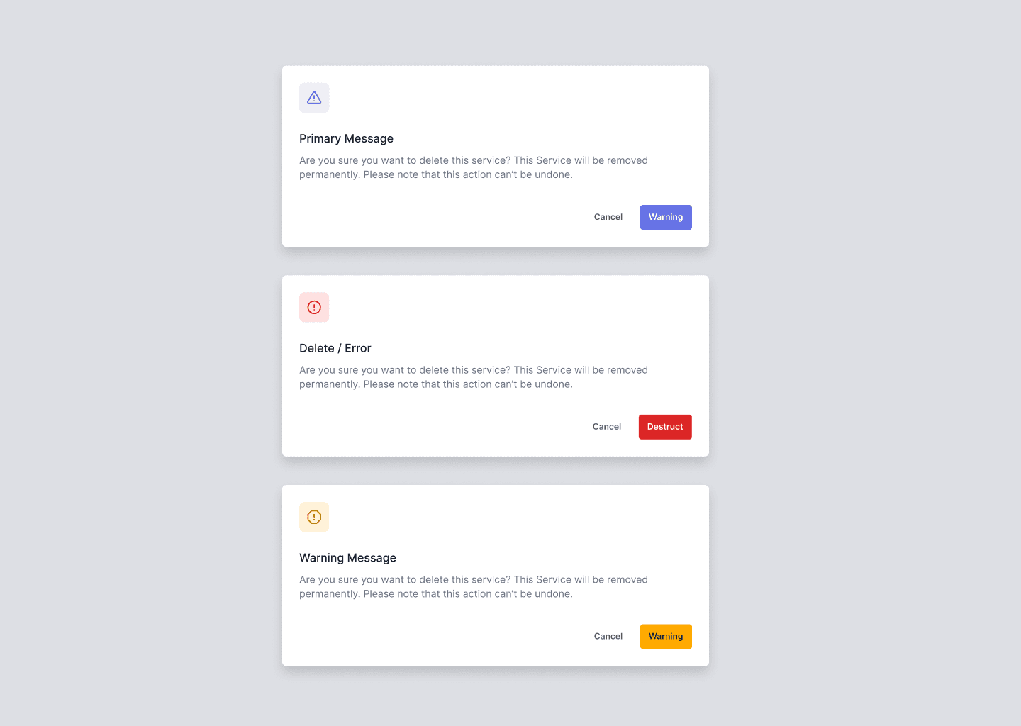
Dialogs
Step 4 : Creating the concept screens
A total of 16 component sets were designed for different elements of the design system, here are a few of them:
Before
After
Dashboard Home
Before
After
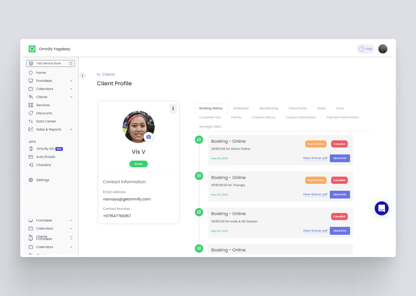
Clients Profile
Before
After
Check-ins Setting
Before
After
Next steps for
the project
1. Full Implementation and Integration:
Finalize the implementation of the design system across all Omnify products, ensuring seamless integration with both the web and mobile applications.
2. Comprehensive Documentation:
Develop detailed guidelines and best practices to support ongoing and future design efforts, making the system easily accessible to all stakeholders.
3. Continuous Iteration:
Gather feedback from designers and developers to identify areas for improvement and keep the design system evolving with new components and patterns as product needs grow.
4. Team Training and Onboarding:
Conduct training sessions and workshops to ensure all team members are familiar with the design system and can leverage it effectively in their workflows.
5. User Testing and Feedback:
Implement usability testing of new components and collect user feedback to validate and refine the system based on real-world use cases.
Overview
This case study outlines the development of a unified design system for the Omnify Dashboard to resolve visual inconsistencies and improve design workflows. As Product Design Lead, I led a small team to create a cohesive visual language and reusable components, enhancing design efficiency and consistency.
COMPANY CONTEXT
Omnify is an integrated platform that helps businesses sell and schedule services, engage with customers, and automate daily operations.
Omnify
Building the Omnify
Design System from Scratch
Role
Lead Product Designer
Team
1 Product Designer
1 Webflow Developer
Dev Team
Problem Statements
Inconsistent design elements across layout, typography,
color, and iconography.
Duplicated components with varying styles.
Lack of responsive design, complicating user navigation
and usability.
IMPACT
These inconsistencies led to a fragmented user experience, making it difficult for users to understand how different parts of the application were related.
For the design team, the absence of a standardized system resulted in increased development time, confusion, and a higher likelihood of design errors.
Challenges & constraints
Limited timeline of 1 month to handoff the design system to devs
Absence of documentation and design components provided no reference points for redesigns.
The dashboard’s complex backend structure made even minor changes challenging, requiring careful adjustments to avoid disruptions.
Step 2 :
Setting up the foundations
Colors
The core consideration while setting up the color palette was scalability of the palette & accessibility.
Grids & Spacing
We implemented a 12-column grid with a 260px offset for consistent layout across the dashboard. The 4px spacing system was chosen for its versatility across screens.
Shadows & Elevation
Typography
We selected ‘Inter’ for its versatility, readability, and extensive features, providing a consistent and clear typographic foundation for the Dashboard.
Iconography
We have implemented the Feather Icons icon set in this version of our design system.
Step 1 :
The Design Audit
INSIGHT 1
Magnitude of the issue
38 Individual components used across the dashboard - each carrying their inconsistent patterns and appearing in variations across different pages in the dashboard.
Lack of standardization in typography, color, iconography, and visual assets resulted in a very random design language
Step 3 :
Designing the Components
A total of 16 component sets were designed for different elements of the design system, here are a few of them:
Buttons
Input Fields
Banners & Alerts
Dialogs
Step 4 : Creating the concept screens
A total of 16 component sets were designed for different elements of the design system, here are a few of them:
Before
After
Dashboard Home
<< DRAG IMAGE >>
Before
After
Clients Profile
<< DRAG IMAGE >>
Before
After
Check-ins Setting
<< DRAG IMAGE >>
Before
After
Next steps for the project
1. Full Implementation and Integration:
Finalize the implementation of the design system across all Omnify products, ensuring seamless integration with both the web and mobile applications.
2. Comprehensive Documentation:
Develop detailed guidelines and best practices to support ongoing and future design efforts, making the system easily accessible to all stakeholders.
3. Continuous Iteration:
Gather feedback from designers and developers to identify areas for improvement and keep the design system evolving with new components and patterns as product needs grow.
4. Team Training and Onboarding:
Conduct training sessions and workshops to ensure all team members are familiar with the design system and can leverage it effectively in their workflows.
5. User Testing and Feedback:
Implement usability testing of new components and collect user feedback to validate and refine the system based on real-world use cases.
Omnify
Building the Omnify
Design System from Scratch
Role
Lead Product Designer
Team
1 Product Designer
Operations Team
Technician Team
Overview
Overview
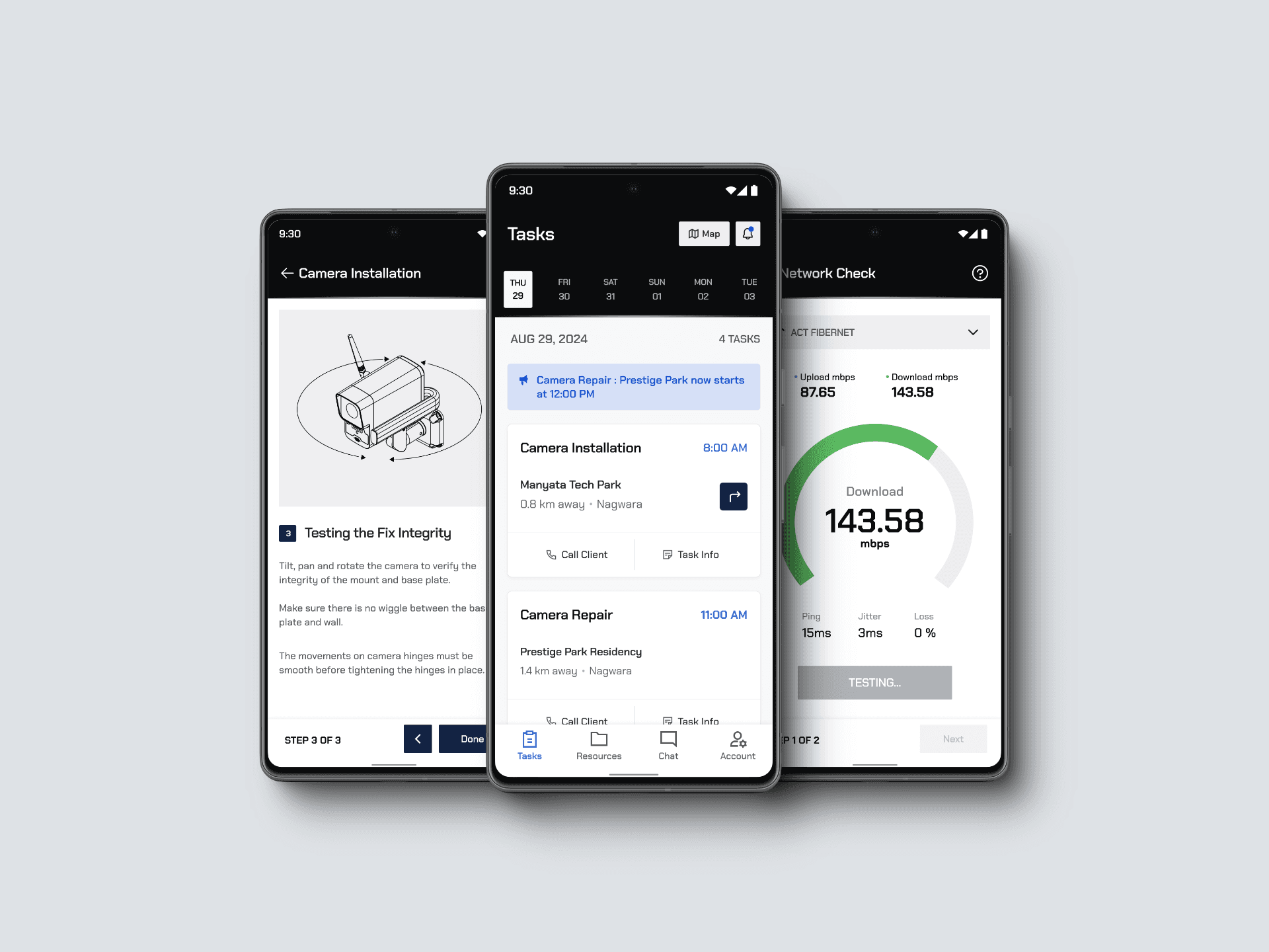
The Prototype of the Technician Service App efficiently solves problems in service provision by combining communication, task handling, and standard operating procedure compliance in a single interface. This app seeks to rectify muddled workflows and fragmented communication that obstruct technicians, therefore hastening operations and improving service excellence for the delight of customers.
This case study outlines the development of a unified design system for the Omnify Dashboard to resolve visual inconsistencies & improve design workflows. As Product Design Lead, I led a small team to create a cohesive visual language and reusable components, enhancing design efficiency and consistency.
COMPANY CONTEXT
Omnify is an integrated platform that helps businesses sell and schedule services, engage with customers, and automate daily operations.
The Crisis at hand
Customers repeatedly express dissatisfaction with the company's service, technical support, and overall service quality. Common issues include delayed installation, malfunctioning cameras, unresponsive technicians, and prolonged resolution times for problems. These recurring complaints suggest key issues in service operations, leading to a negative customer experience and a significant loss of trust in the company.
Problem Statements
To gain more clarity, we initiated a preliminary research project to understand the problem better.
WHAT WE DID
We conducted Interviews with Ops Agents & Technicians of varying experience levels to understand the depths of service experience team’s day to day workflows.
We conducted field observations and ride-alongs with technicians during their service visits to identify challenges that they face - while on the job.
Inconsistent design elements across layout, typography,
color, and iconography.
Inconsistent design elements across layout, typography, color, and iconography.
Duplicated components with varying styles.
Duplicated components with
varying styles.
Lack of responsive design, complicating user navigation
and usability.
Our analysis revealed that while challenges existed across Operations, Technicians, and Clients, many of these issues could be traced back to the technician's workflow. Addressing challenges in the technician workflow through a product seemed to prove most impactful in the short term, and we found that this approach offered a significant return on investment compared to other potential solutions.
IMPACT
These inconsistencies led to a fragmented user experience, making it difficult for users to understand how different parts of the application were related. For the design team, the absence of a standardized system resulted in increased development time, confusion, and a higher
likelihood of design errors.
These inconsistencies led to a fragmented user experience, making it difficult for users to understand how different parts of the application were related.
For the design team, the absence of a standardized system resulted in increased development time, confusion, and a higher
likelihood of design errors.


Technicians were struggling to deliver consistent, high-quality service due to a fragmented and disorganized process. Relying on multiple communication tools (WhatsApp, phone calls, paper SOPs) led to confusion, delays, and errors. As a result, the company experienced growing client dissatisfaction and frustration, as service quality suffered and expectations weren’t met. After closely examining the workflow, we identified key pain points which we dive into below.
Challenges & constraints
Technician Adoption isn’t guaranteed
Limits on standardised SOP flexibility
Dependancy on other System
Integrations
Device & platform compatibility
Limited timeline of 1 month to handoff the design system to devs
Limited timeline of 1 month to handoff the design system to devs
Absence of documentation and design components provided no reference points for redesigns.
Absence of documentation and design components provided no reference points for redesigns.
The dashboard’s complex backend structure made even minor changes challenging, requiring careful adjustments to avoid disruptions.
The dashboard’s complex backend structure made even minor changes challenging, requiring careful adjustments to avoid disruptions.
Step 1 :
The Design Audit
INSIGHT 1
Scheduling & Task
Management can be overwhelming for Technicians
Technicians constantly juggle phone calls, WhatsApp messages, and other communication channels to stay updated regarding their task assignments.
With constantly volatile schedules and having to plan their schedule and travel accordingly, while on the move - makes their workflow stressful and creates a chaotic environment, thereby impacting their overall productivity and efficiency.

Magnitude of the issue
38 Individual components used across the dashboard - each carrying their inconsistent patterns and appearing in variations across different pages in the dashboard.
Lack of standardization in typography, color, iconography, and visual assets resulted in a very random design language
Lack of standardization in typography, color, iconography,
and visual assets resulted in a
very random design language
Typography
We selected ‘Inter’ for its versatility, readability, and extensive features, providing a consistent and clear typographic foundation for the Dashboard.
Colors
The core consideration while setting up the color palette was scalability of the palette & accessibility.
Grids & Spacing
We implemented a 12-column grid with a 260px offset for consistent layout across the dashboard.
The 4px spacing system was chosen for its versatility across screens.
Iconography
We have implemented the Feather Icons icon set in this version of our design system.
Shadows & Elevation
Step 2 :
Setting up the foundations
Next steps for the project
1. Full Implementation and Integration:
Finalize the implementation of the design system across all Omnify products, ensuring seamless integration with both the web and mobile applications.
2. Comprehensive Documentation:
Develop detailed guidelines and best practices to support ongoing and future design efforts, making the system easily accessible to all stakeholders.
3. Continuous Iteration:
Gather feedback from designers and developers to identify areas for improvement and keep the design system evolving with new components and patterns as product needs grow.
4. Team Training and Onboarding:
Conduct training sessions and workshops to ensure all team members are familiar with the design system and can leverage it effectively in their workflows.
5. User Testing and Feedback:
Implement usability testing of new components and collect user feedback to validate and refine the system based on real-world use cases.
Step 4 :
Creating the concept screens
A total of 16 component sets were designed for different elements of the design system, here are a few of them:
Dashboard Home
Clients Profile
BEFORE

AFTER
Check-ins Setting
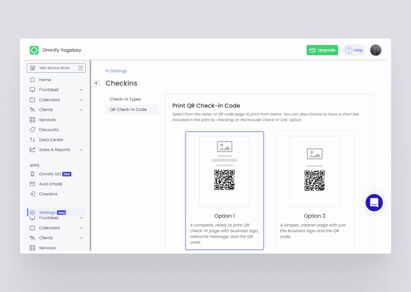
BEFORE
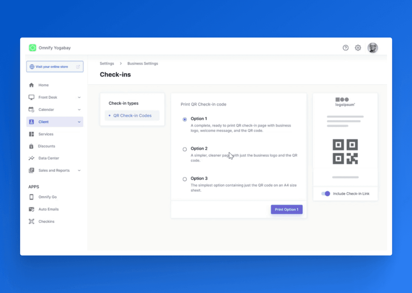
AFTER

BEFORE

AFTER
Step 3 :
Designing the Components
A total of 16 component sets were designed for different elements of the design system, here are a few of them:
Buttons
Input Fields
Banners & Alerts
Dialogs